Campfire Coffee Shop
The Challenge
Campfire Coffee loved the concept of Fika so much that they wanted to build their whole brand around it. It was my goal to make this happen, while ensuring they stood out from those around them.


The Solution
The Solution
The Solution
Fika embodies more than a concept; it’s a state of mind, an attitude, and a cherished part of Swedish culture. Rooted in the belief that making time for daily Fika is essential, it signifies moments shared over coffee (or tea) and a small treat with friends and colleagues.
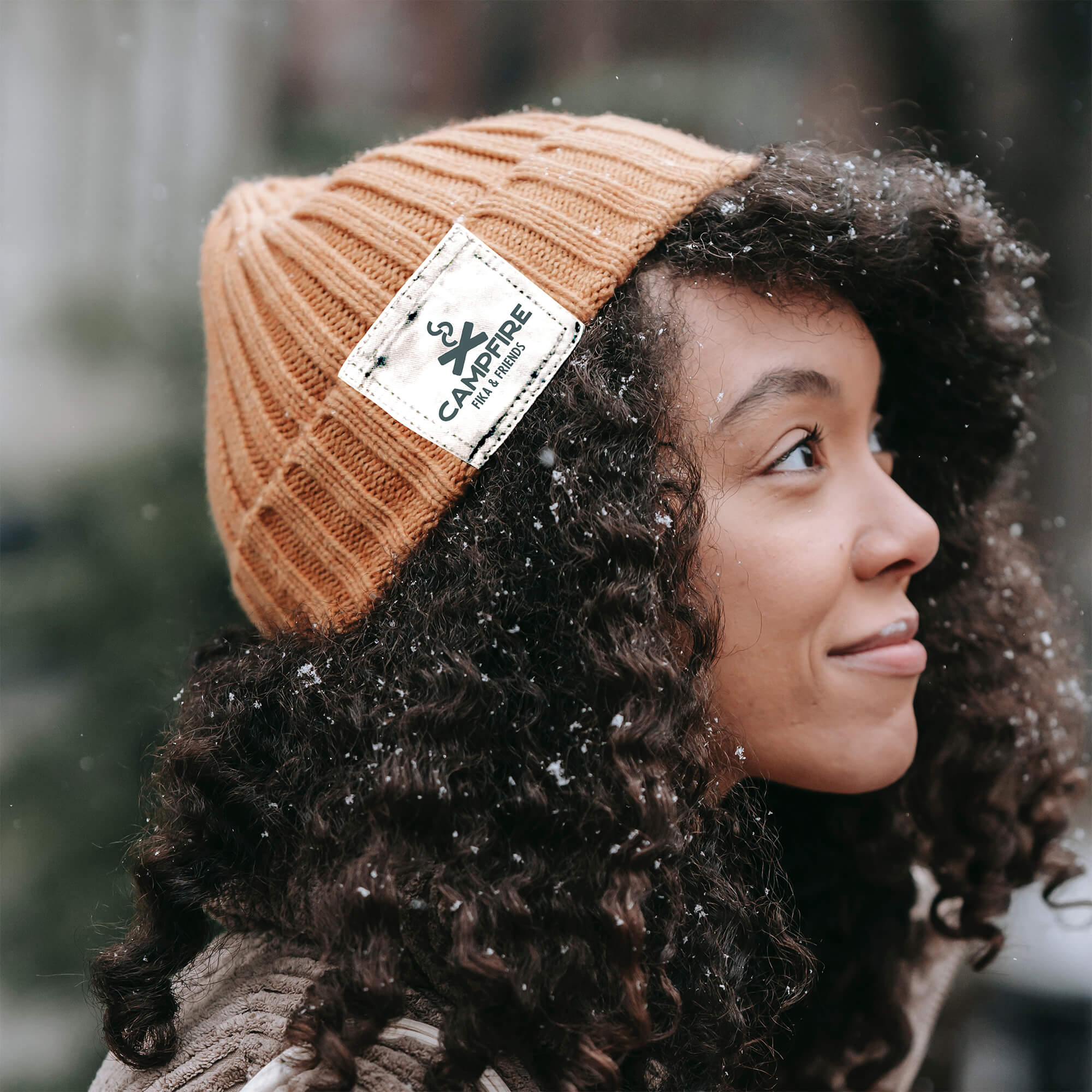
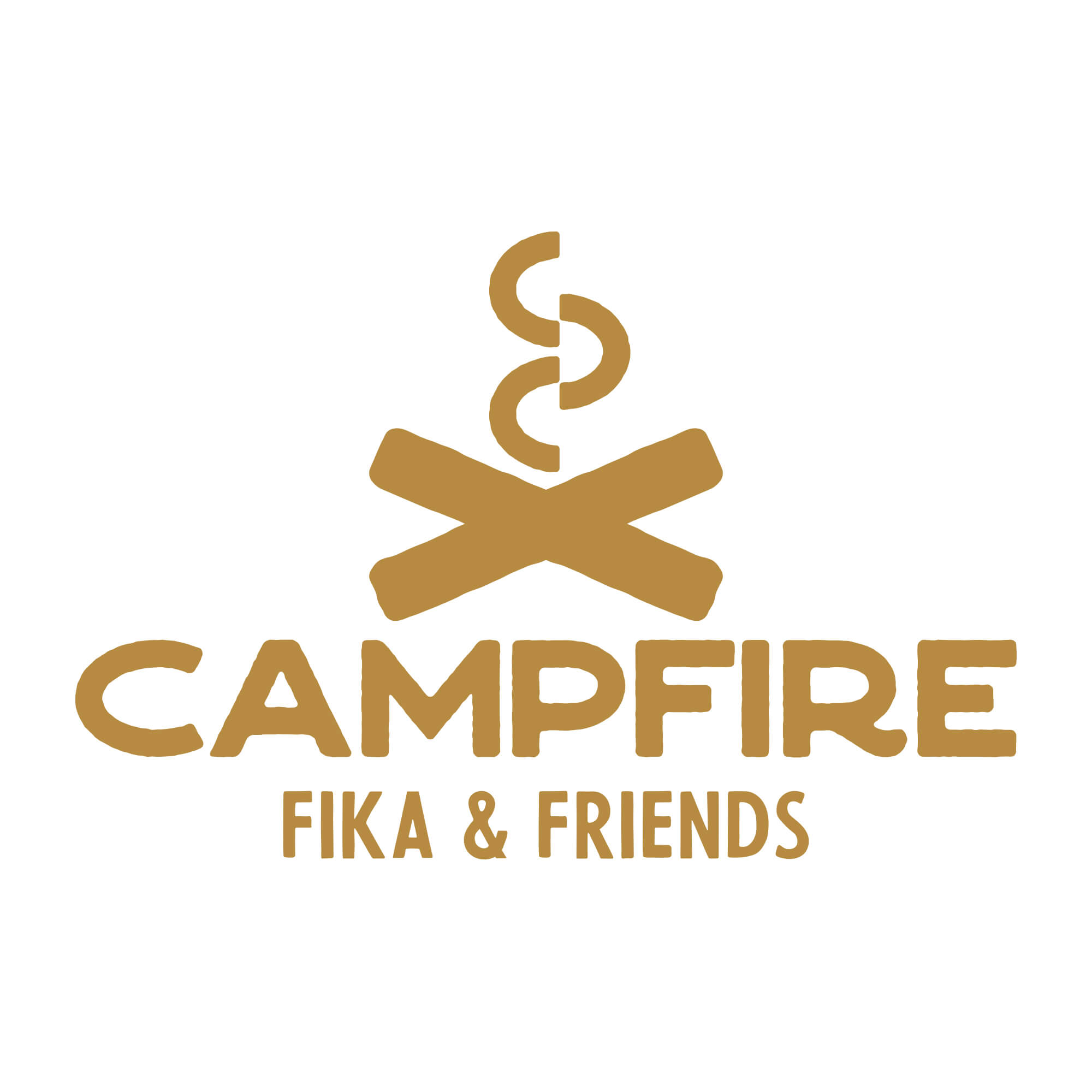
We conceptualised the logo around an abstract campfire logomark, cleverly merging a simple emoji with the spirit of sharing.
This simplicity carried through to the brand's identity, featuring a soothing yet rugged colour palette. The rounded, calming typography evokes a distinctly Nordic feel. We also crafted a series of patterns, adding unique textures to various contexts, representing the brand in subtle yet impactful ways.
Fika embodies more than a concept; it’s a state of mind, an attitude, and a cherished part of Swedish culture. Rooted in the belief that making time for daily Fika is essential, it signifies moments shared over coffee (or tea) and a small treat with friends and colleagues.
We conceptualised the logo around an abstract campfire logomark, cleverly merging a simple emoji with the spirit of sharing.
This simplicity carried through to the brand's identity, featuring a soothing yet rugged colour palette. The rounded, calming typography evokes a distinctly Nordic feel. We also crafted a series of patterns, adding unique textures to various contexts, representing the brand in subtle yet impactful ways.