The Good Taco Mexican
The Challenge
A vibrant and youthful cantina needed an image that reflected their personality. Something that they could make their own as well and allow them to express themselves.


The Solution
The Solution
The Solution
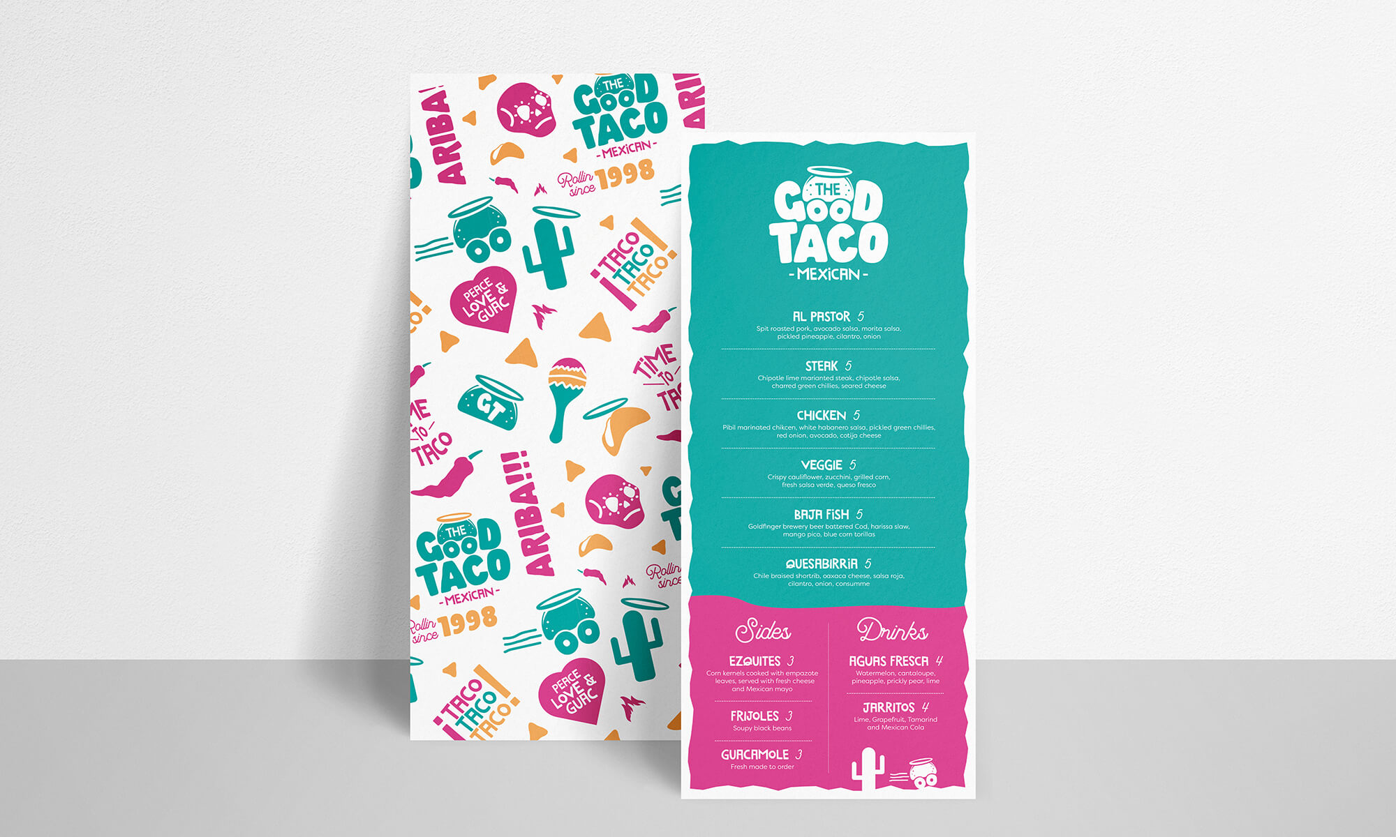
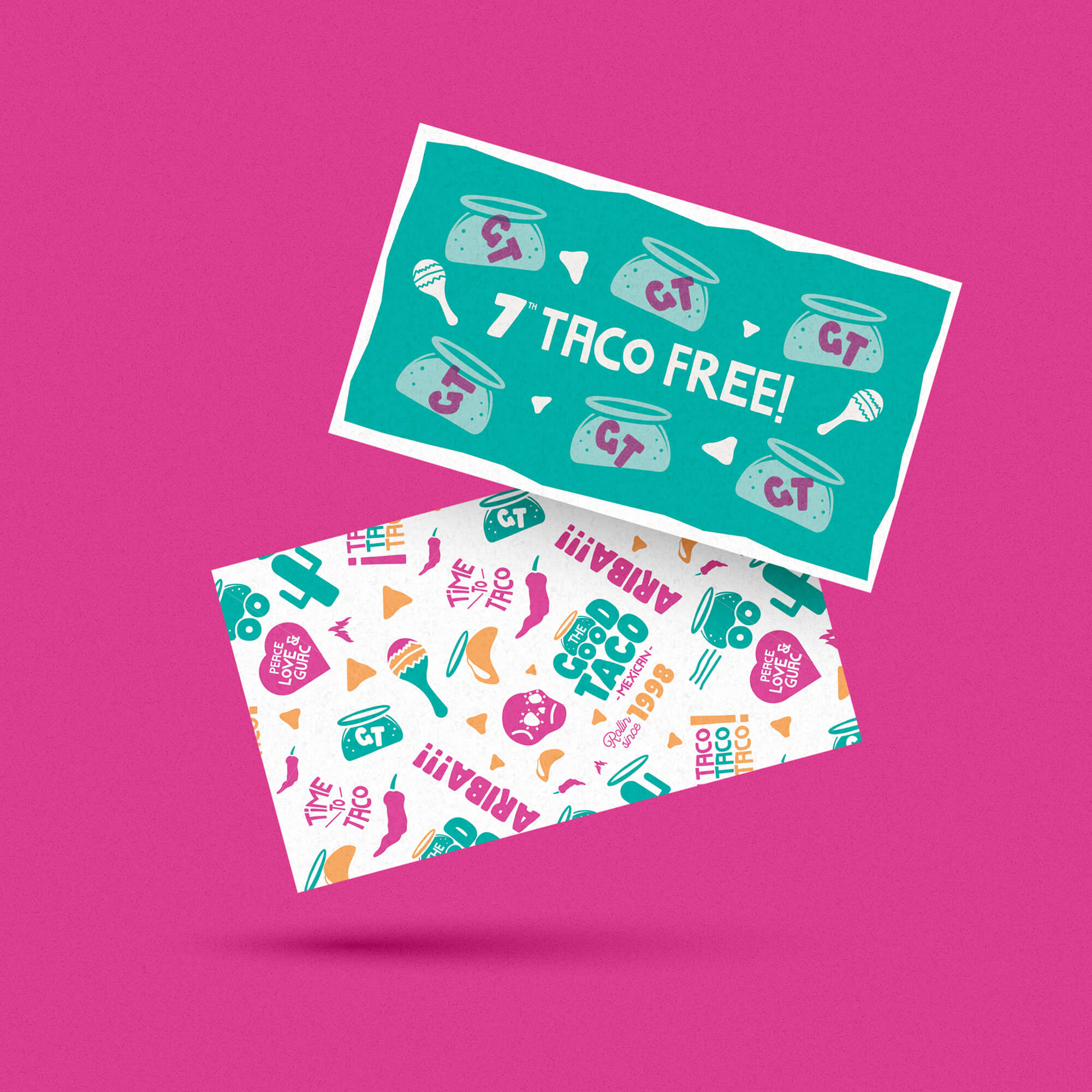
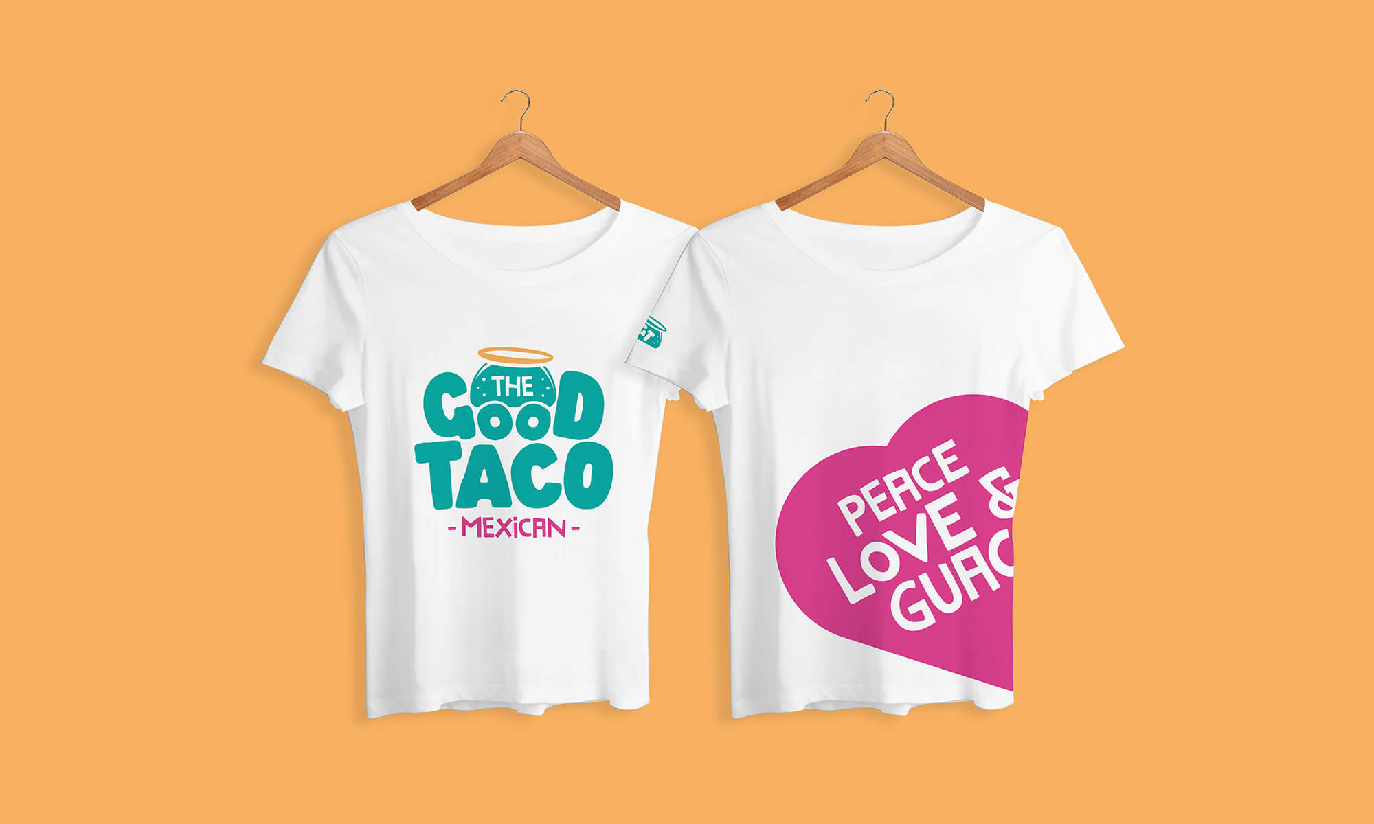
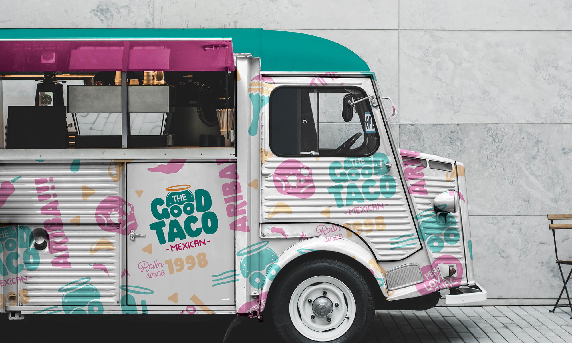
The Cantina’s origins as a humble taco truck inspired the logo, paying homage to their roots. From there, we developed a series of simplified versions, ideal for when a smaller logo is needed.
We crafted a distinctive typographic and colour system, honouring their youthful Latin roots while infusing playfulness into the copy.
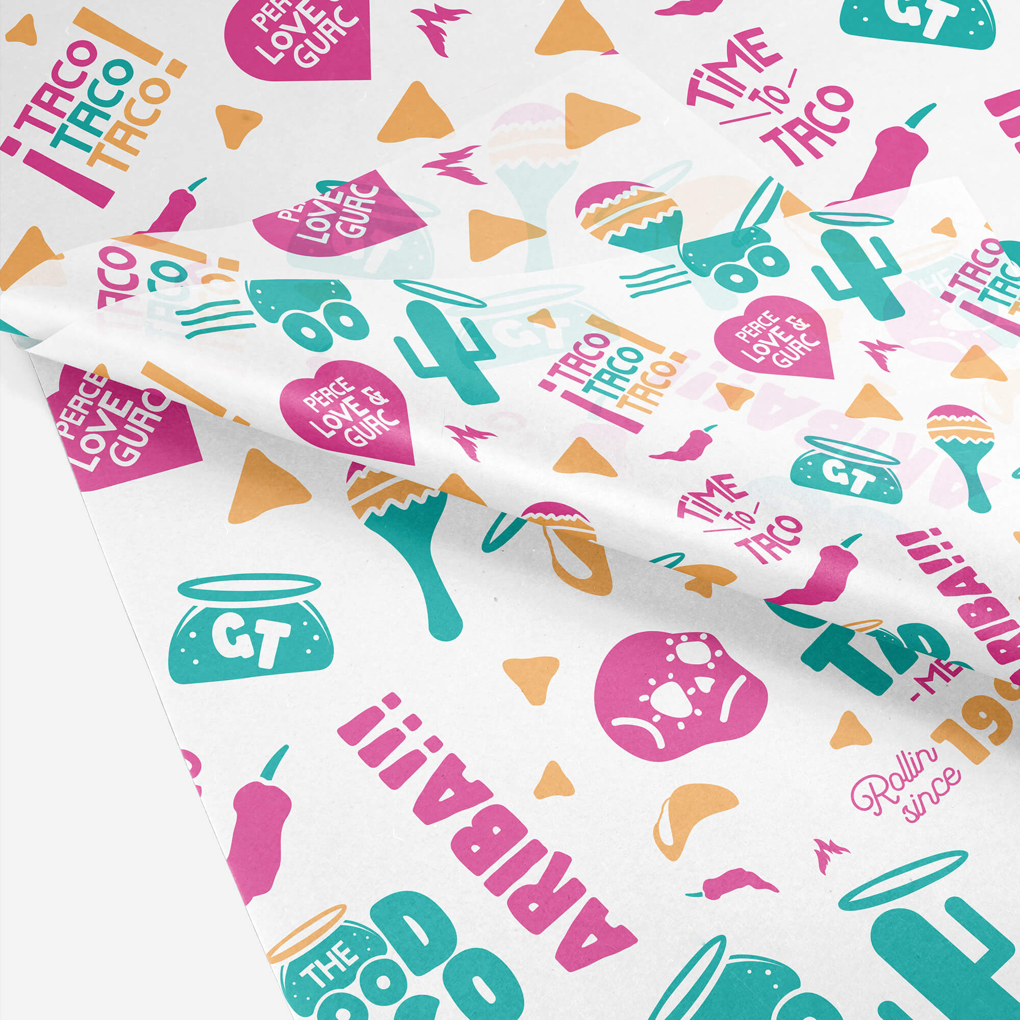
The rest of the brand expression was built around themed illustrations, creating a fun stickerbomb effect that we applied across the brand.
The Cantina’s origins as a humble taco truck inspired the logo, paying homage to their roots. From there, we developed a series of simplified versions, ideal for when a smaller logo is needed.
We crafted a distinctive typographic and colour system, honouring their youthful Latin roots while infusing playfulness into the copy.
The rest of the brand expression was built around themed illustrations, creating a fun stickerbomb effect that we applied across the brand.