Lunar Coffee
The Challenge
The astrology and coffee loving founders at Lunar Coffee needed a look that showed the world their two main passions and set them apart from the pack.

The Solution
The Solution
The Solution
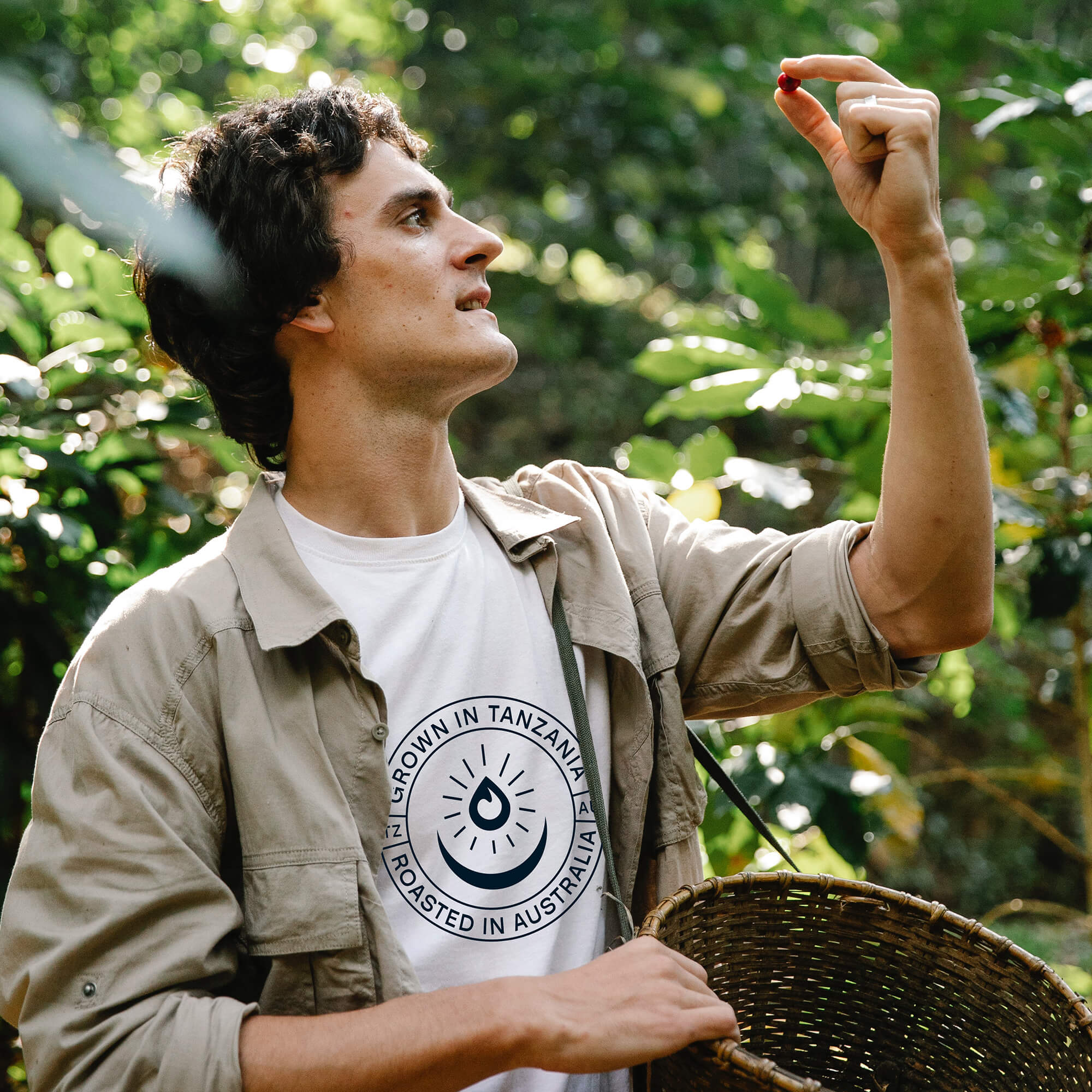
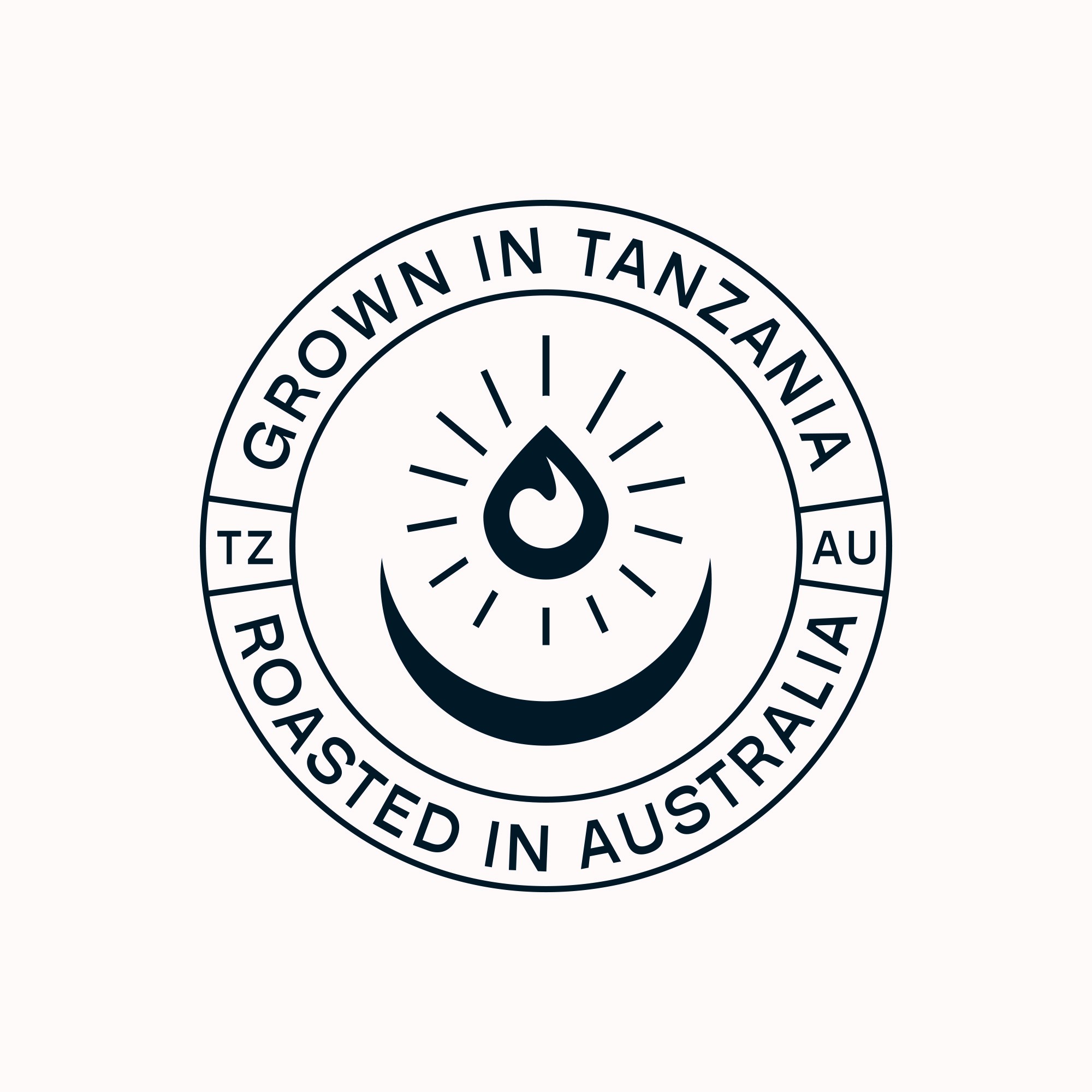
I crafted an understated yet striking logo, featuring a distinctive logomark that reflects the founders' dual passions. A range of logo variations, including a seal of approval, was developed to create a responsive system, ensuring consistent representation across various sizes.
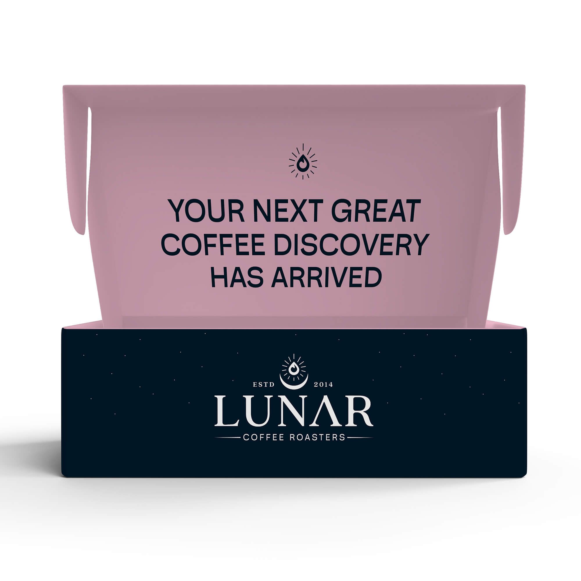
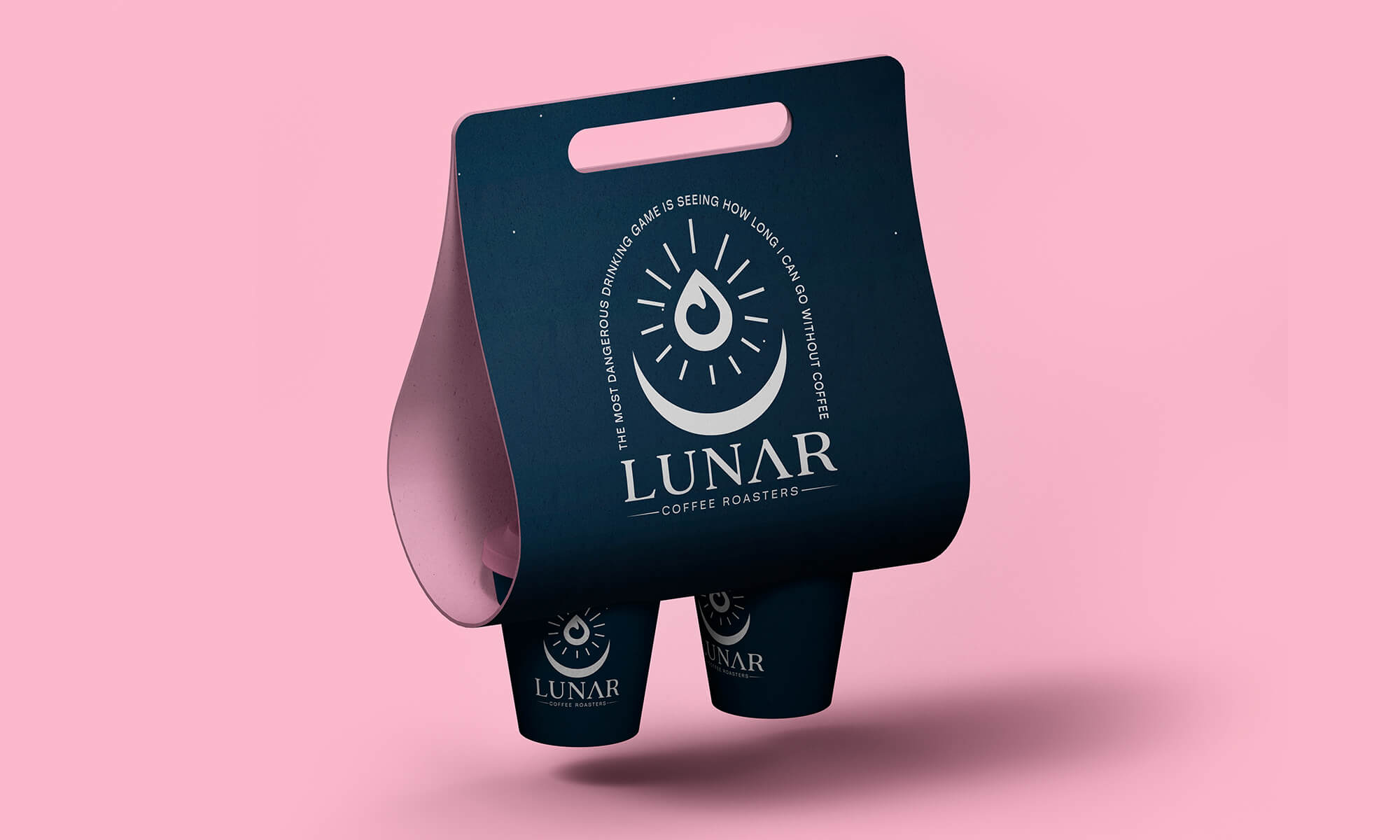
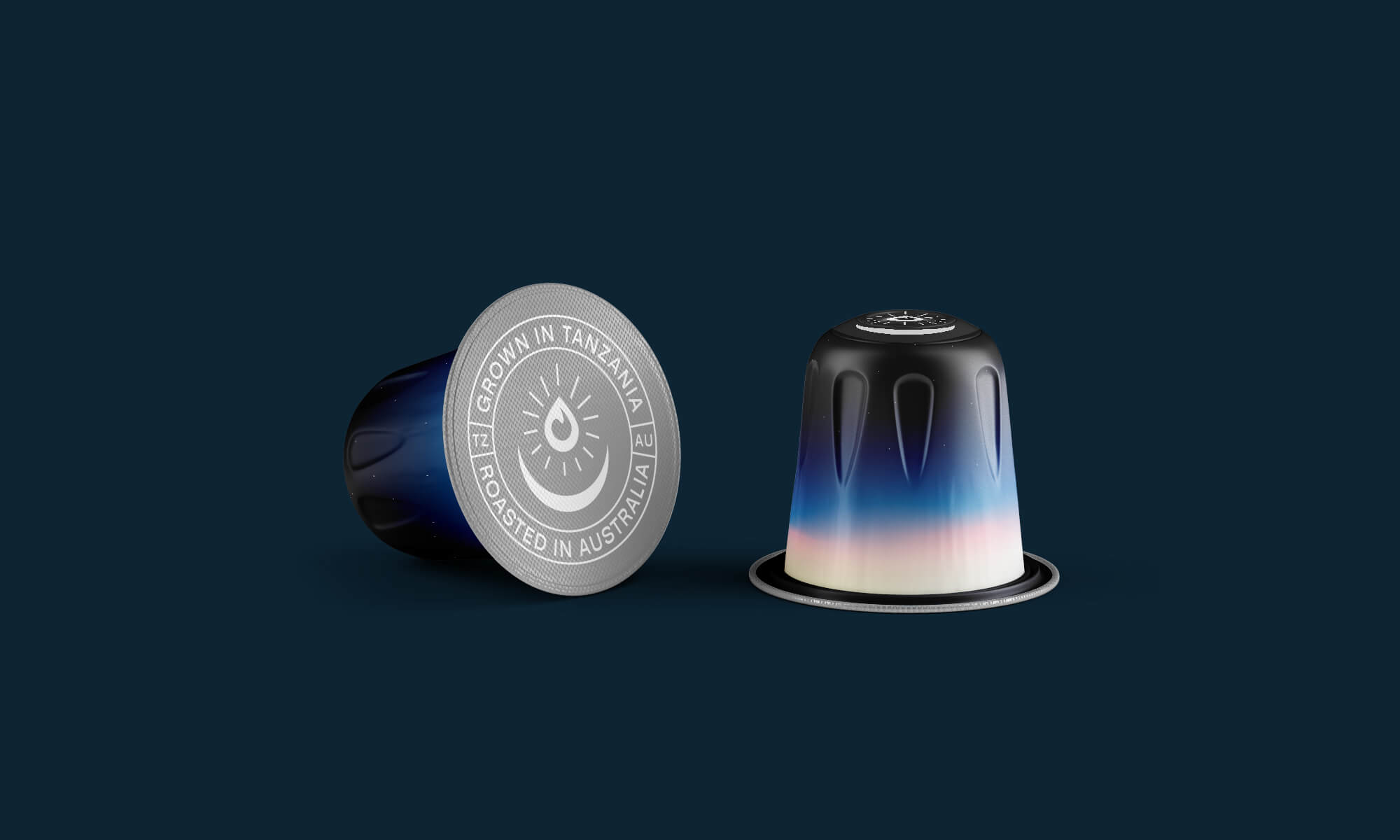
With contemporary typography and bold colours, I enhanced the brand's visual identity. Drawing inspiration from the cosmos, I incorporated gradients to offer a unique and practical way to differentiate packaging and flavours.
These design elements extended effortlessly across the brand’s ecosystem, from merchandise and seeding kits to concept packaging for coffee packets (their immediate focus) and pod coffee (a future goal).
I crafted an understated yet striking logo, featuring a distinctive logomark that reflects the founders' dual passions. A range of logo variations, including a seal of approval, was developed to create a responsive system, ensuring consistent representation across various sizes.
With contemporary typography and bold colours, I enhanced the brand's visual identity. Drawing inspiration from the cosmos, I incorporated gradients to offer a unique and practical way to differentiate packaging and flavours.
These design elements extended effortlessly across the brand’s ecosystem, from merchandise and seeding kits to concept packaging for coffee packets (their immediate focus) and pod coffee (a future goal).