Pleesecakes
The Challenge
Pleese Group came to us at ZAP Creative in 2023 for their rebrand and launch of Freezecakes, aiming to become the world’s most exciting dessert brand. With a strong social media presence showcasing unique creations, they expanded their range to appeal to a wider market, differentiating from brands like Häagen-Dazs and Ben & Jerry’s.


The Solution
The Solution
The Solution
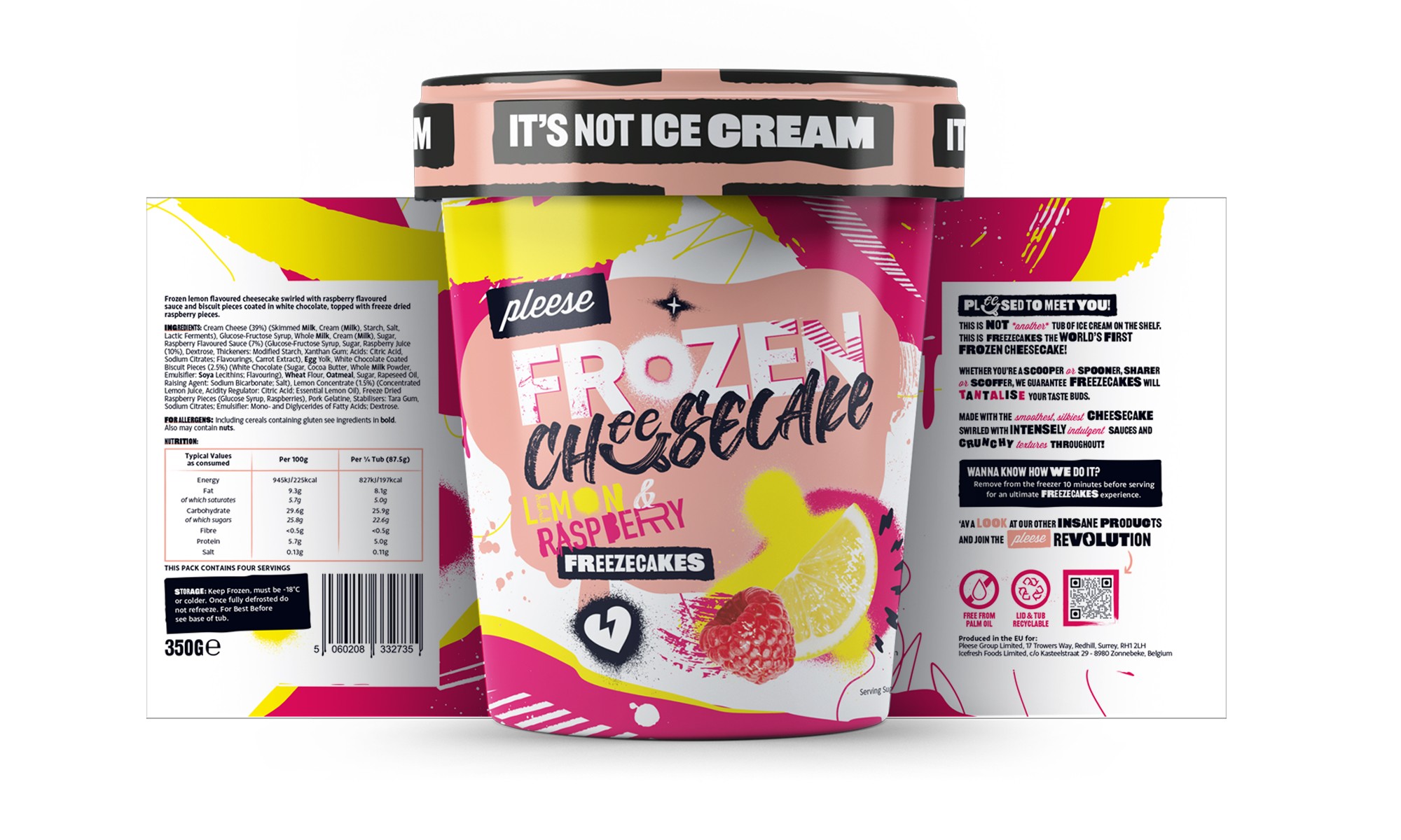
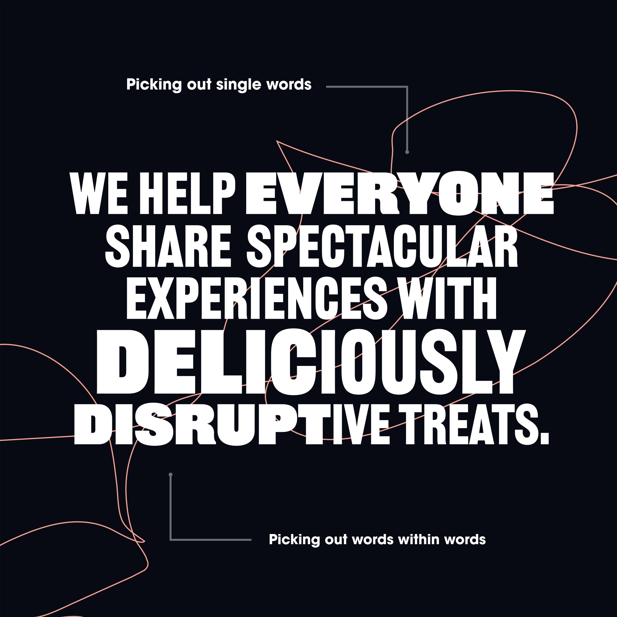
Through a comprehensive strategy session, we identified that the competition largely adopts a classic and traditional aesthetic. While many explore innovative flavour variations, they play it safe with their visual identity. As part of the team at ZAP Creative, we repositioned the product as a bold, edgy, and disruptive challenger brand with a personal, DIY aesthetic.
We applied this style to everything—from colours and typography to tone of voice and custom illustrations. We then rolled it out across the full packaging range, social media posts, illustrations, and merchandise.
As a result, the product quickly gained listings in Waitrose, Co-op, and other supermarkets across the UK, and continues to go from strength to strength.